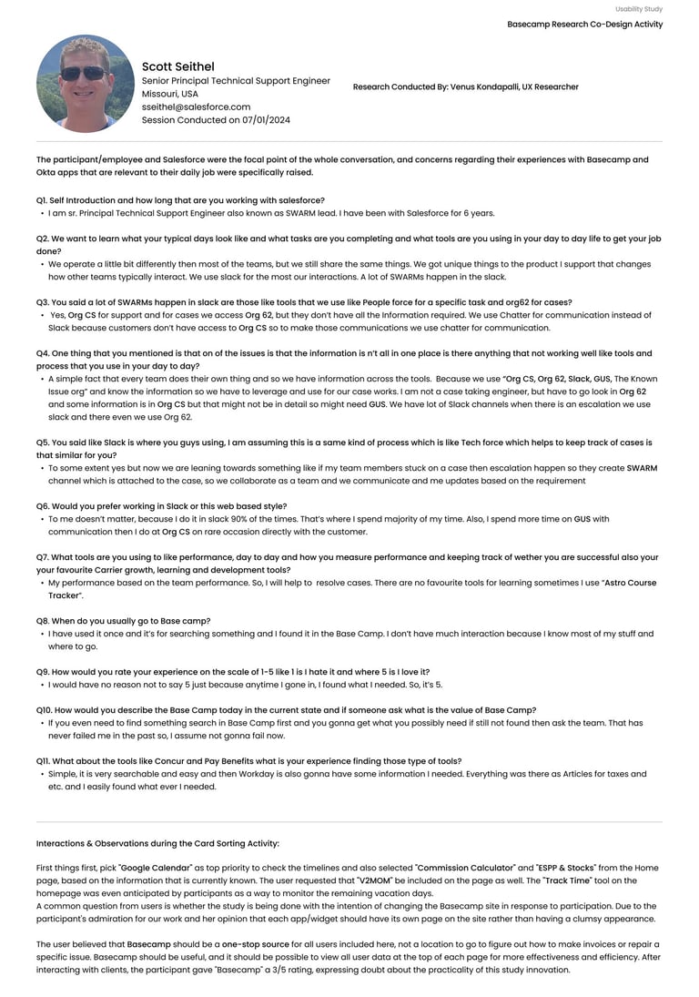
Project Careerconnect
Career Connect is a Salesforce-based platform designed to streamline career services operations — connecting students with employers, advisors, and job opportunities in a centralized, intelligent ecosystem. The existing process was fragmented, manual, and opaque for all stakeholders.
Problem
Salesforce service teams struggled with a fragmented ecosystem — relying on scattered spreadsheets, endless email threads, and outdated portals to manage manager relationships, onboard new profiles, and coordinate events. Employees lacked visibility into their own standing, while managers were buried under the weight of Okta's multi-tool stack, context-switching constantly just to stay afloat. On the employer side, candidate matching was frustratingly imprecise — manually tracking individual skill metrics and software development progress across siloed systems turned every hiring decision into an exhausting, error-prone process.

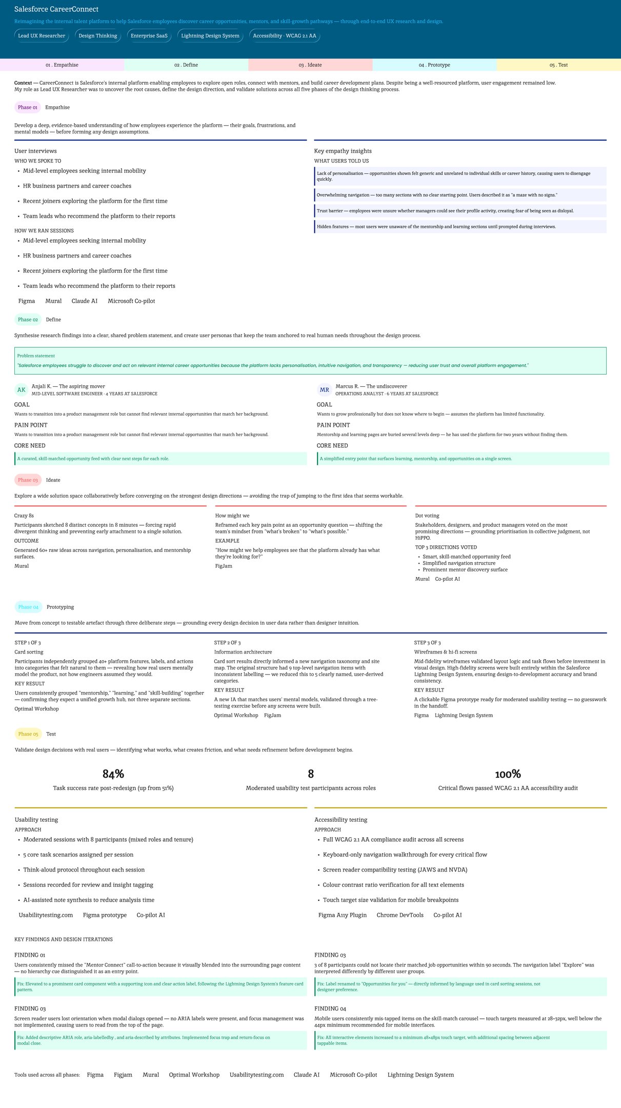
CareerConnect is Salesforce's internal platform enabling employees to explore open roles, connect with mentors, and build career development plans. Despite being a well-resourced platform, user engagement remained low. My role as Lead UX Research &. Design Expert was to uncover the root causes, define the design direction, and validate solutions across all five phases of the design thinking process.
UX Research for Basecamp — Salesforce Integration Study
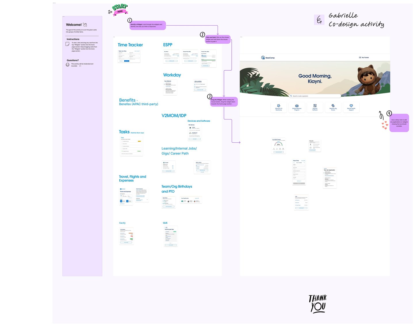
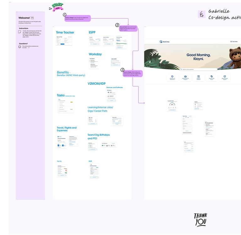
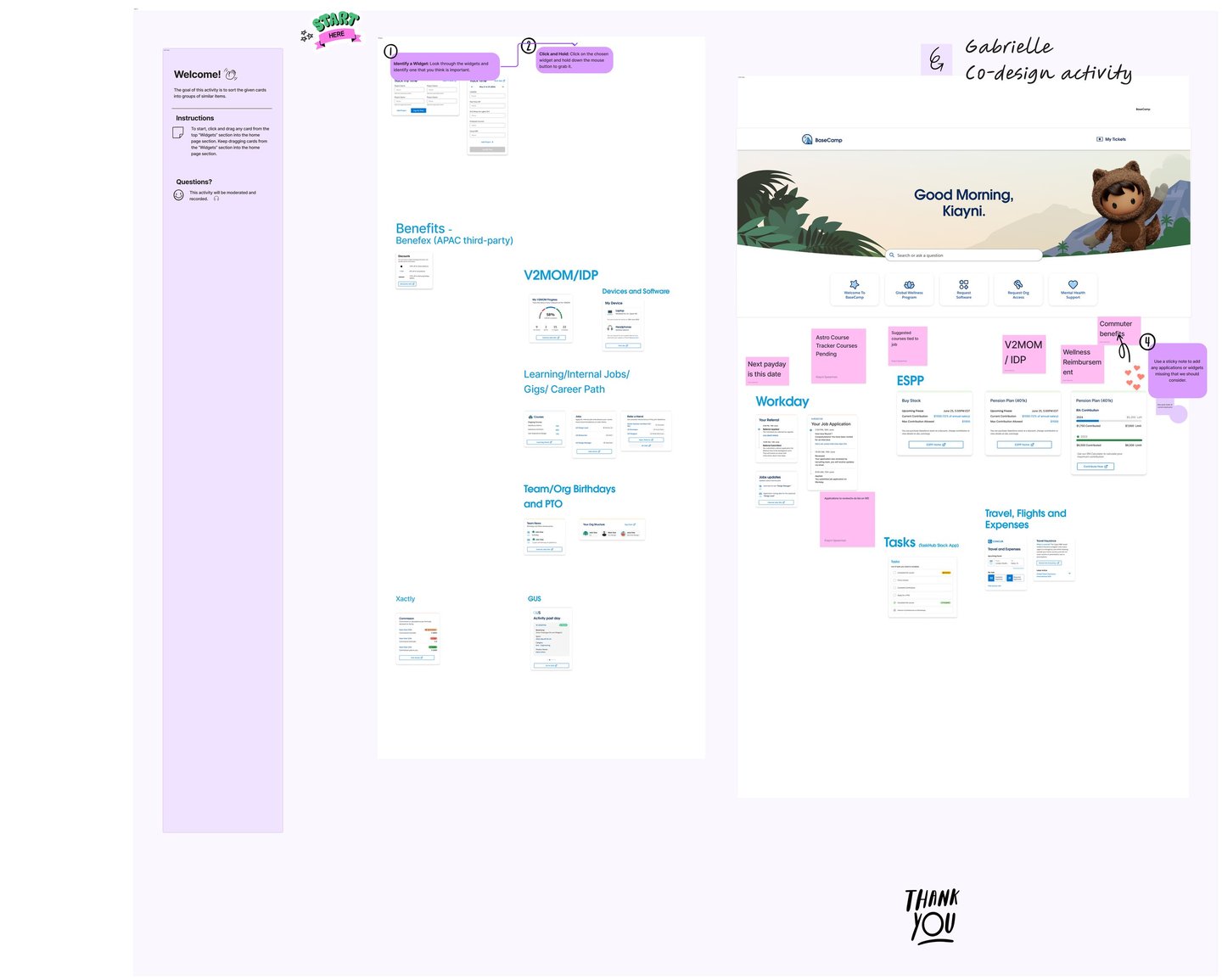
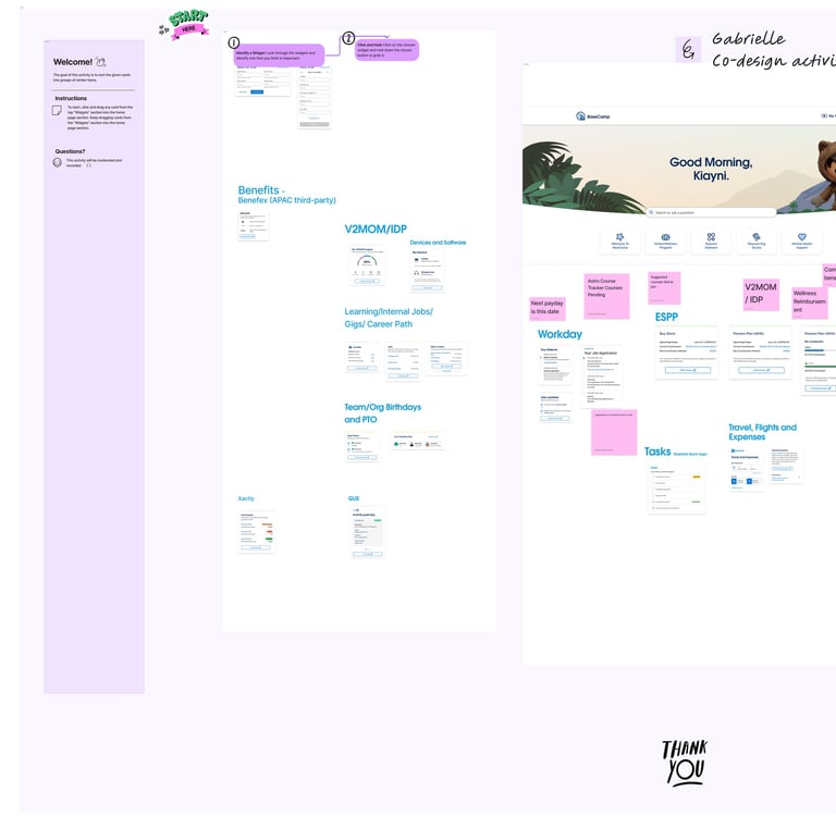
To inform the design direction for Basecamp, I conducted structured user interviews with Salesforce employees to surface their core pain points, motivations, and daily workflow frustrations. These conversations formed the foundation of a comprehensive UX research report built around two primary artefacts.
User personas were developed to translate raw interview insights into vivid, actionable representations of the target audience. These personas gave product managers a clear, evidence-grounded picture of user expectations — moving decision-making away from assumptions and toward documented human needs.
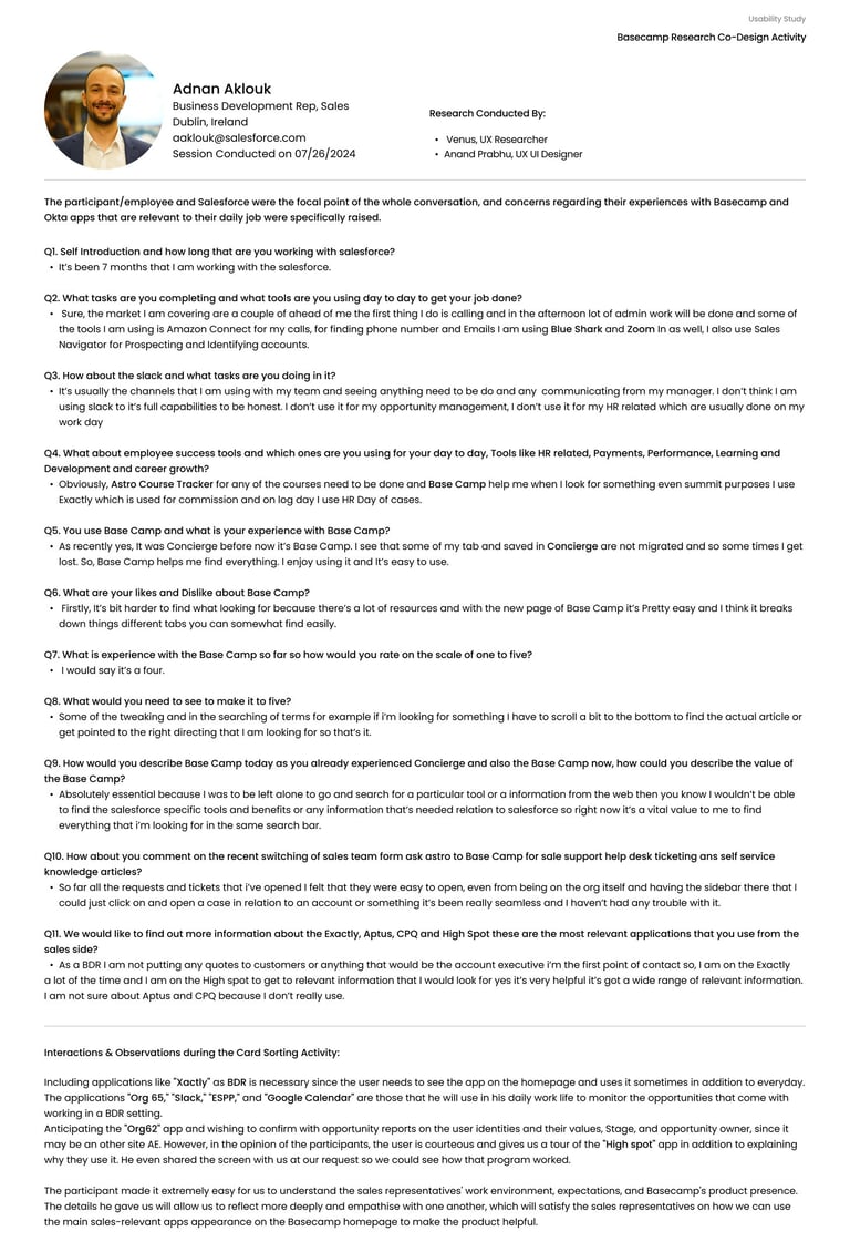
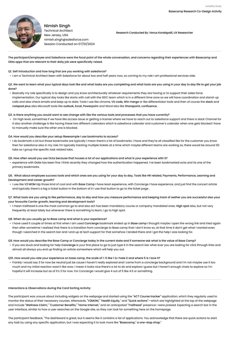
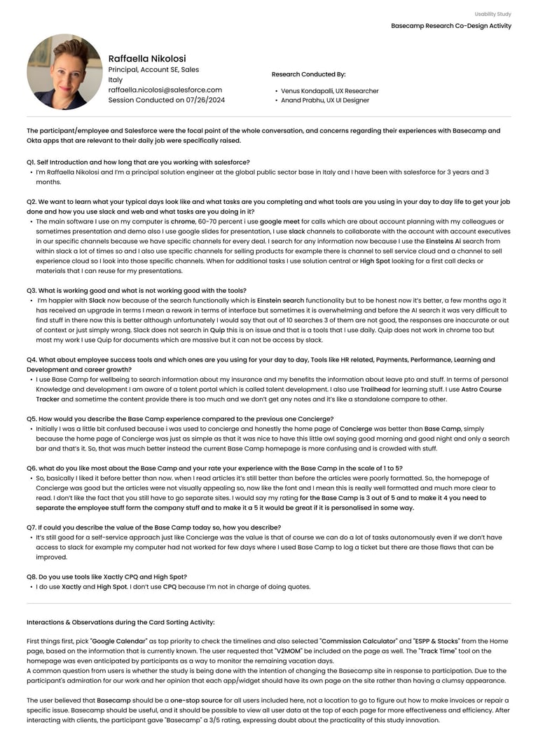
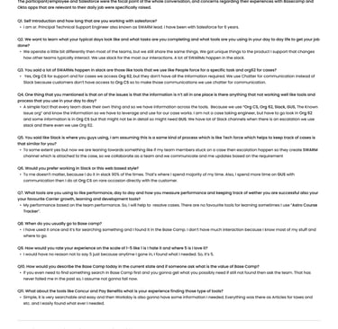
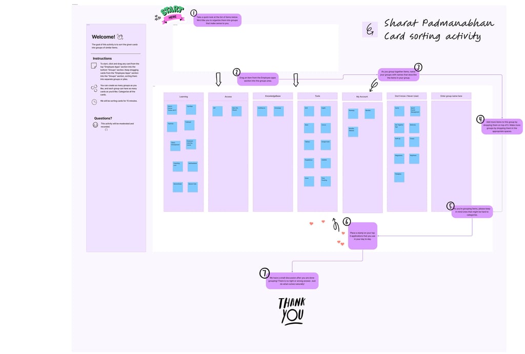
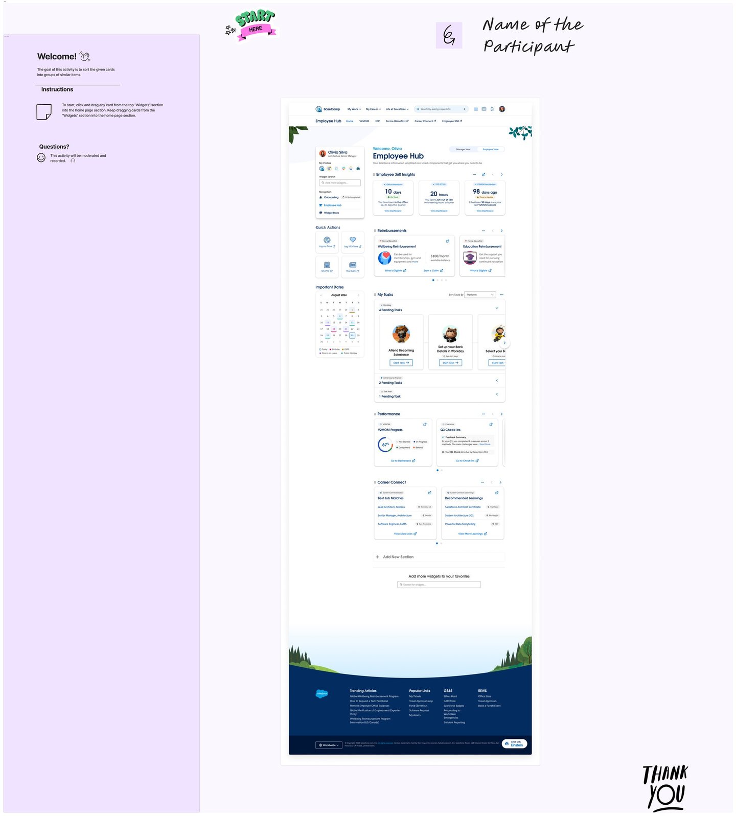
Card sorting activities complemented this by revealing how users naturally organise and relate to the tools in their daily environment. A key finding was that Salesforce employees already operate across a familiar ecosystem of platforms — accessed primarily through Okta — and carry well-established mental models about how software should behave and where things should live.
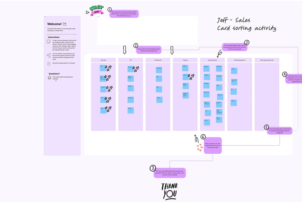
These insights collectively pointed to a clear opportunity: Basecamp, as a SaaS platform, could significantly reduce the time and cognitive effort employees spend switching between tools and navigating fragmented workflows. By embedding seamlessly within the Salesforce environment and aligning with the platforms users already rely on every day, Basecamp empowers employees to complete tasks more efficiently — without disrupting their existing habits or requiring them to learn an entirely new system from scratch.
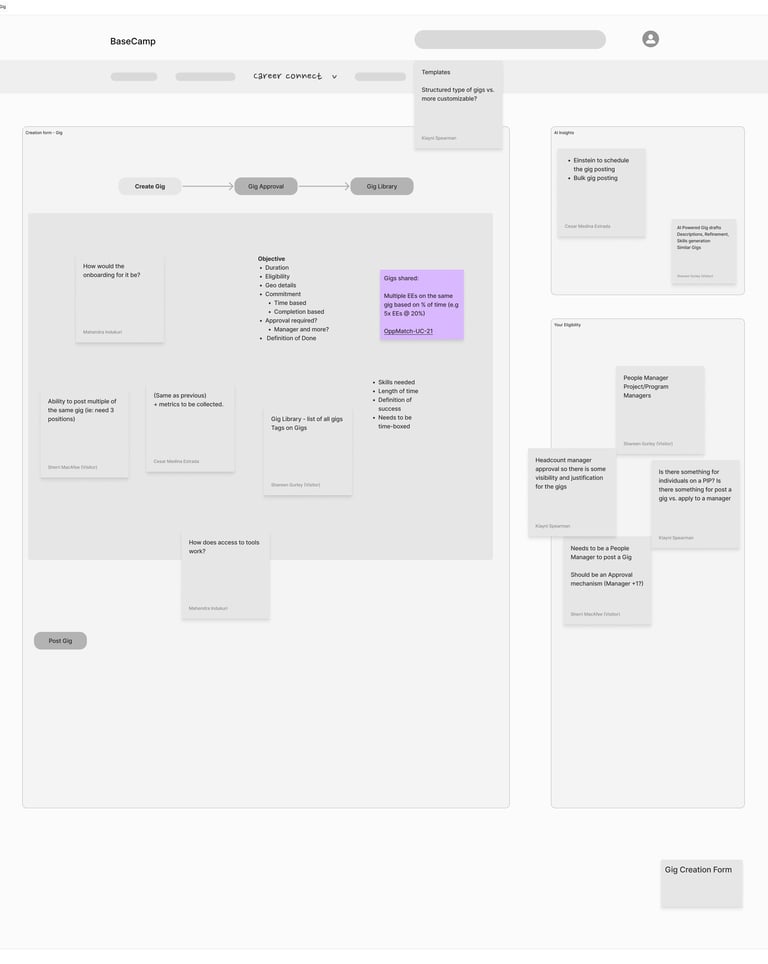
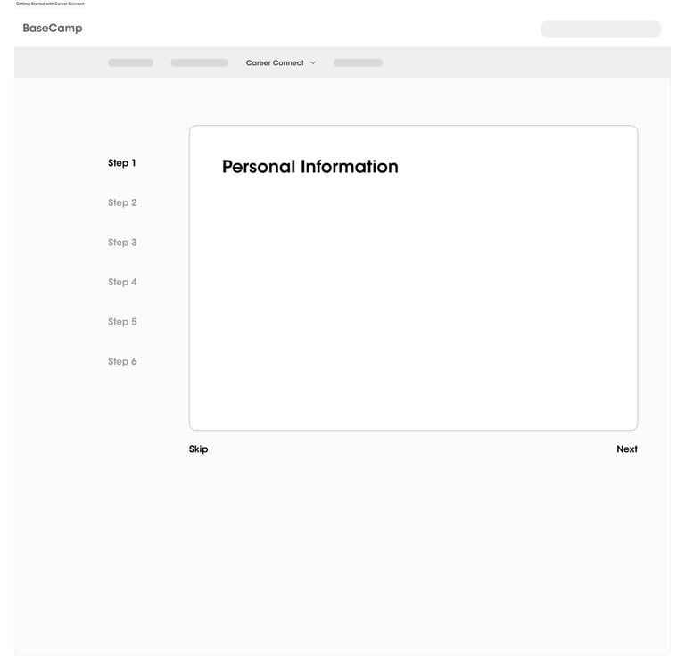
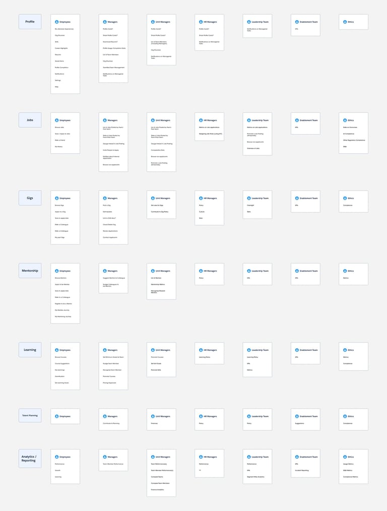
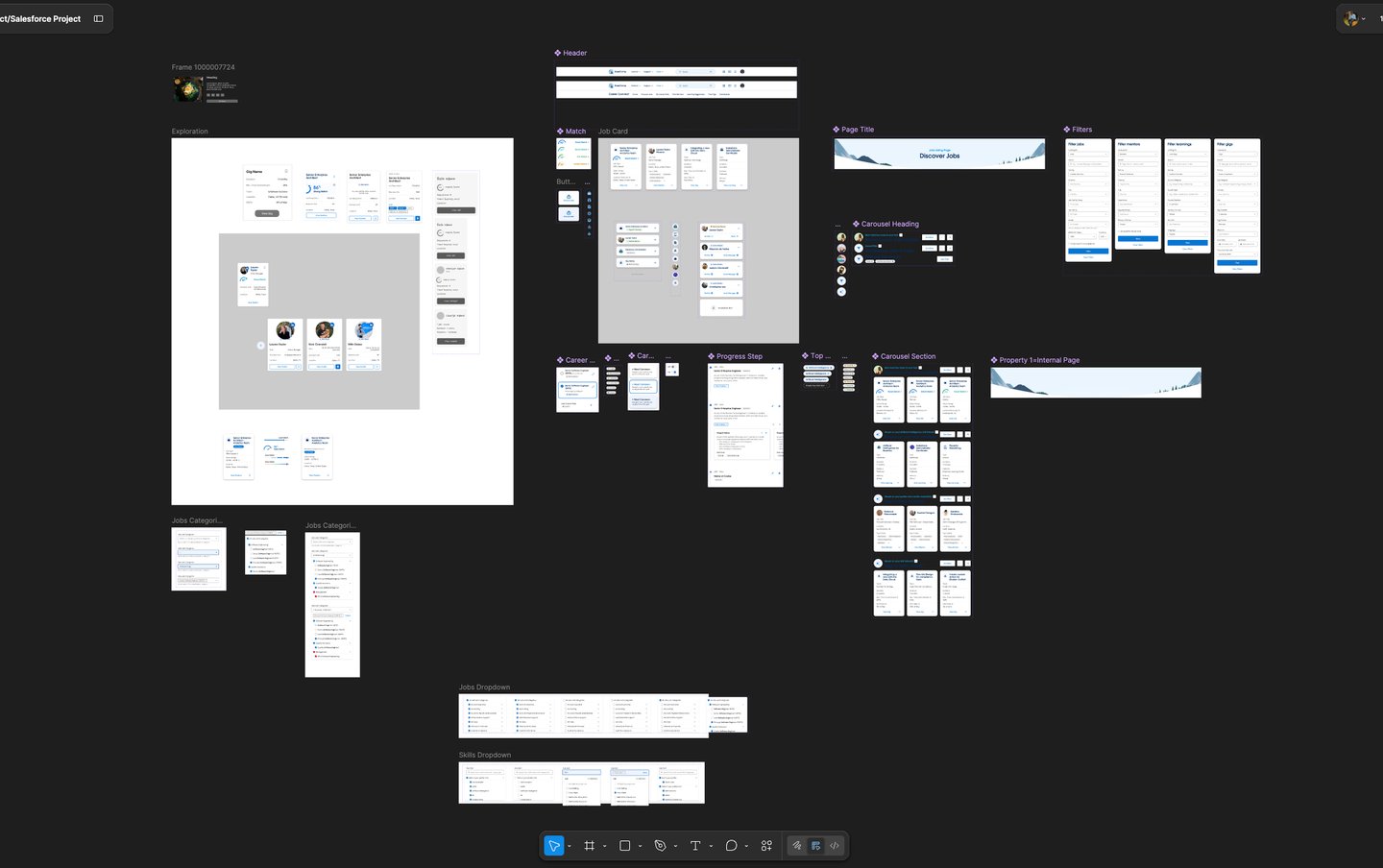
The low-fidelity wireframes in this project establish the core user flows, information architecture, and functional layout of the platform. They enable rapid iteration, early usability validation, and stakeholder alignment without the distraction of visual design. By resolving structural and UX challenges at this stage, the transition to high-fidelity mockups becomes efficient and focused—allowing the final designs to concentrate on visual hierarchy, branding, and interaction details built on a validated foundation.
The wireframes establish complete user journeys—from onboarding to job application—ensuring a seamless and logical navigation structure before moving into visual design.
They define content hierarchy, screen structure, and component placement, creating a solid blueprint that guides consistent and scalable high-fidelity UI design.
They allow quick modifications and testing of multiple ideas, helping identify usability gaps and refine flows without investing time in detailed visuals.
These wireframes prioritise functionality, usability, and user behaviour—ensuring the product is intuitive before enhancing aesthetics.
With validated flows and layouts, the transition to high-fidelity mockups becomes faster and more efficient, allowing focus on branding, visual hierarchy, and interactions.
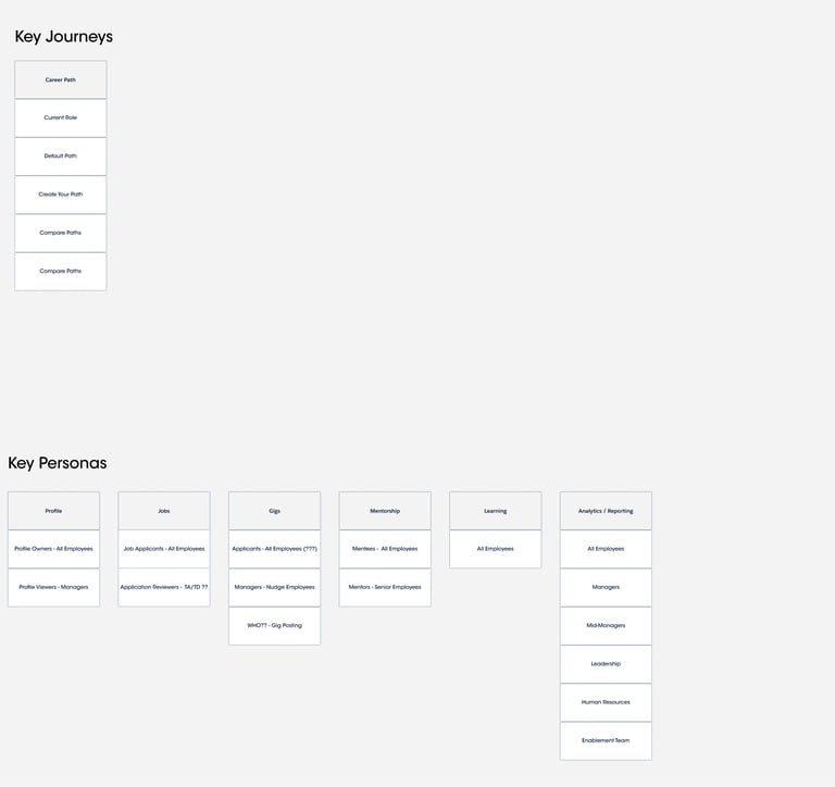
The Career Path module empowers employees to take control of their professional growth by providing structured and flexible pathways
Users can explore default career paths based on organizational roles
Ability to create personalized career journeys aligned with individual goals
Compare multiple career trajectories to make informed decisions
Visibility into current role vs future opportunities
Encourages long-term planning with clarity and direction
UX Strategy & Experience Design
Career path framework
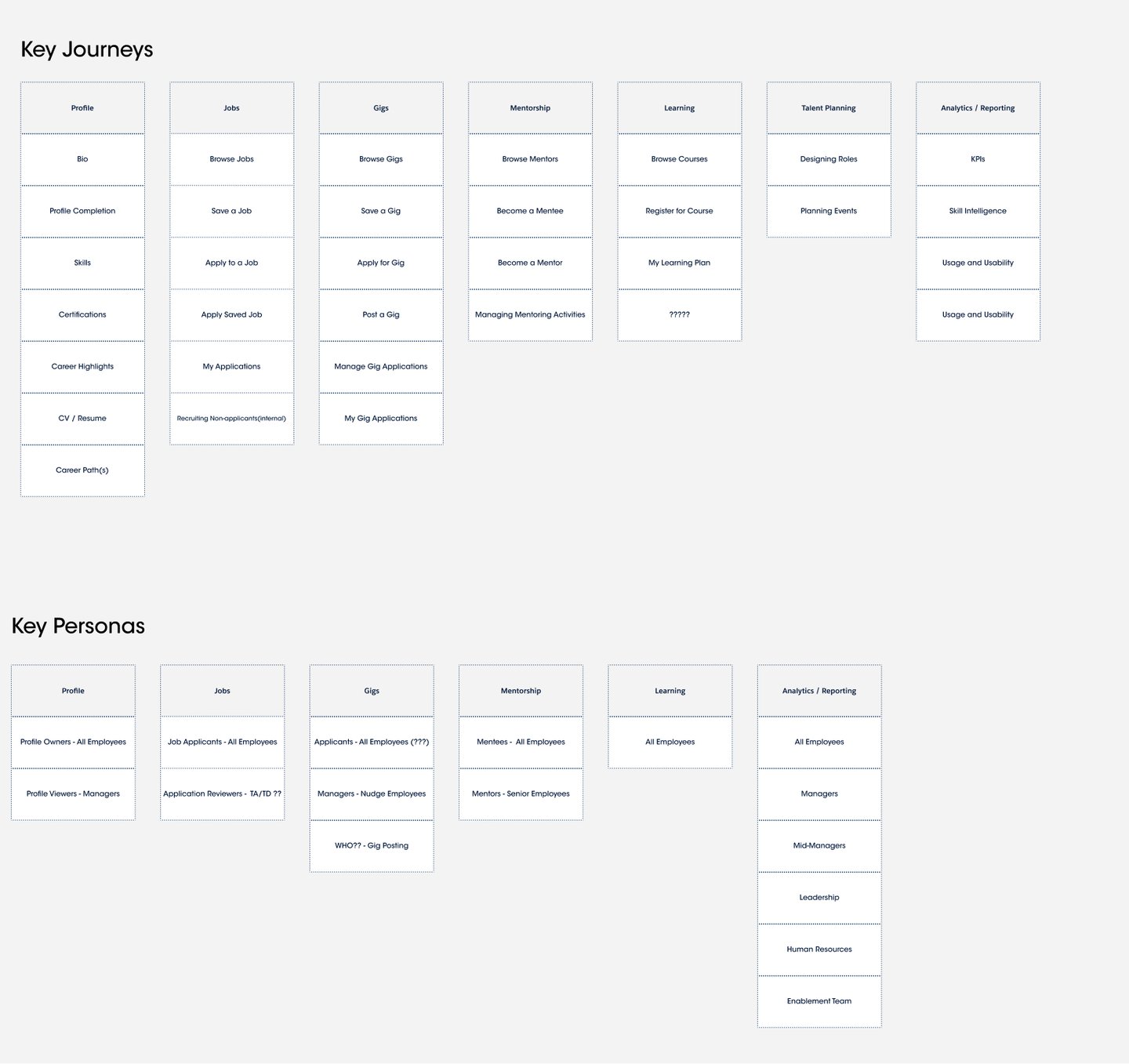
Journey Mapping Across Key Modules
The platform is designed around interconnected journeys that support end-to-end employee growth:
Profile → Build identity with skills, certifications, and career highlights
Jobs → Discover, save, and apply for internal opportunities
Gigs → Engage in short-term projects for skill expansion
Mentorship → Connect with mentors or become one
Learning → Access courses and track learning plans
Talent Planning → Align individual growth with organizational needs
Analytics & Reporting → Monitor performance, skills, and engagement
User Activities & Interactions
The Career Path module empowers employees to take control of their professional growth by providing structured and flexible pathways
Users can explore default career paths based on organizational roles
Ability to create personalized career journeys aligned with individual goals
Compare multiple career trajectories to make informed decisions
Visibility into current role vs future opportunities
Encourages long-term planning with clarity and direction
Using components from the Salesforce Lightning Design System (SLDS) in the Figma file significantly helps me building high-fidelity wireframes efficiently and consistently. SLDS provides a library of pre-built, reusable UI components and design patterns, allowing designers to avoid reinventing elements and focus on user experience and functionality.
It ensures a consistent visual language and interaction behaviour across the entire product, which improves usability and brand alignment
The system also enables faster design-to-development handoff, as components in Figma closely map to actual code implementations, reducing gaps between design and engineering.
With built-in guidelines for accessibility, responsiveness, and scalability, designers can confidently create enterprise-ready interfaces that work across devices.
Additionally, the structured framework and design tokens support easy updates and iteration, making it simple to maintain and evolve the product over time.
SLDS empowers designers to build high-fidelity mockups that are consistent, scalable, and production-ready from the start.
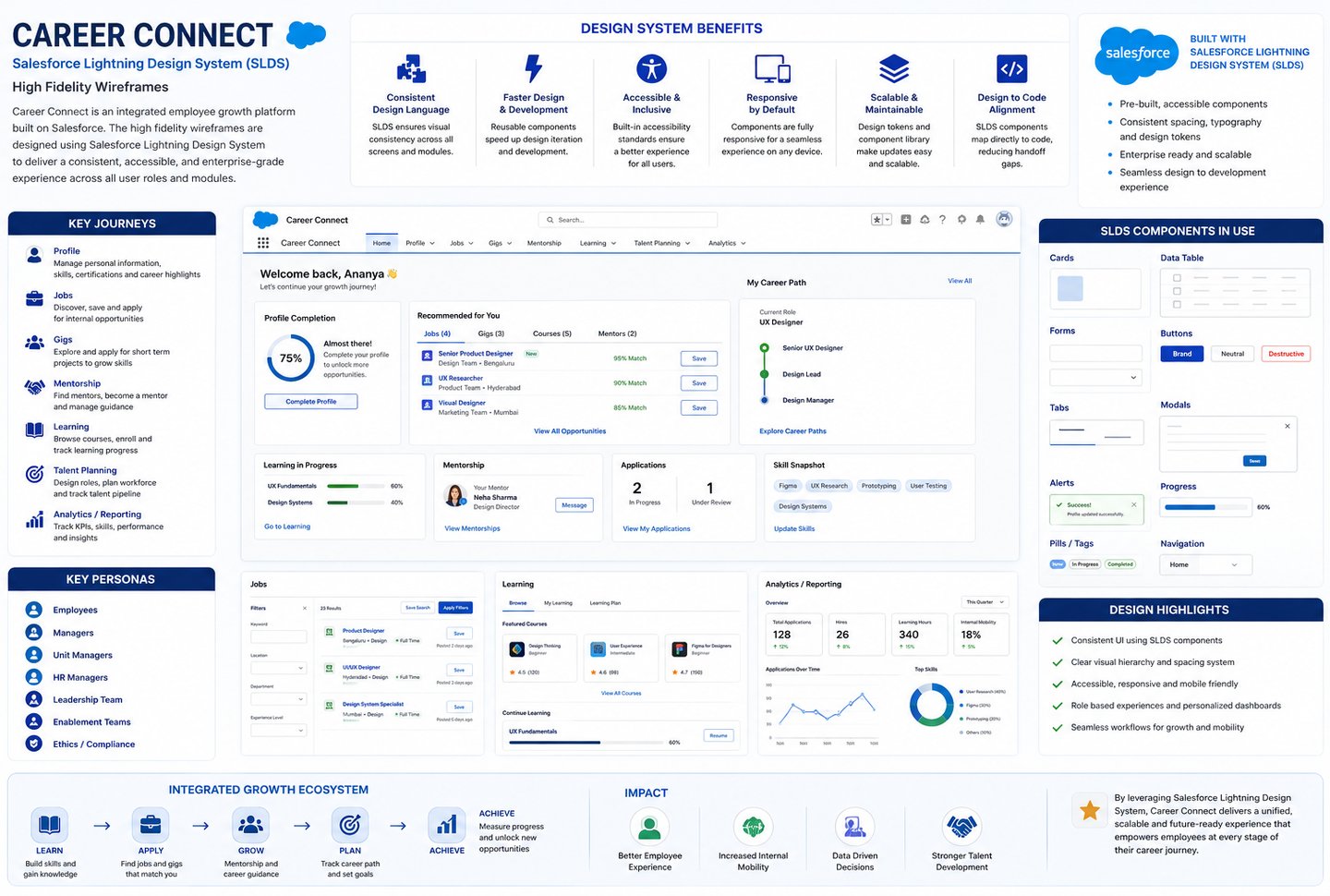
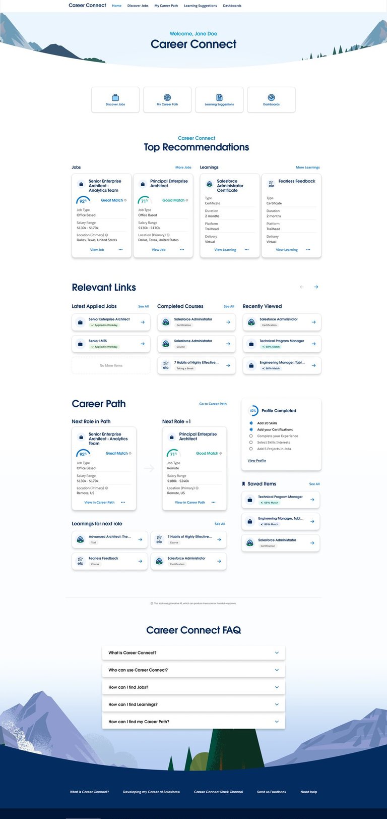
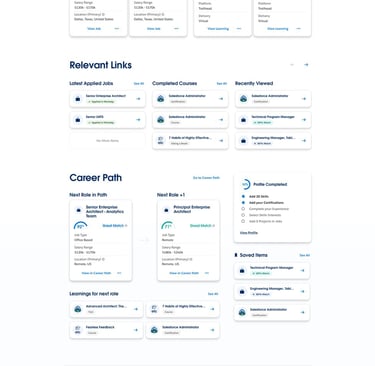
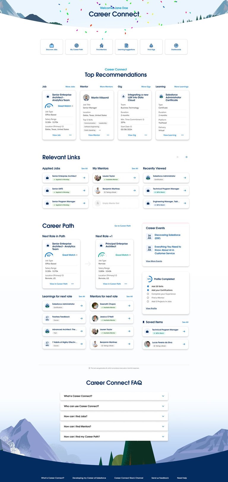
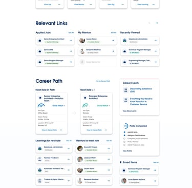
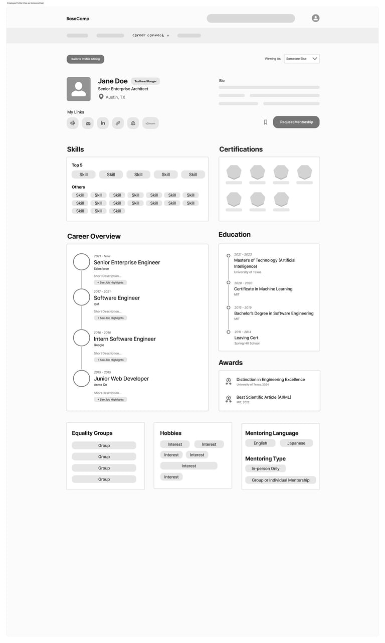
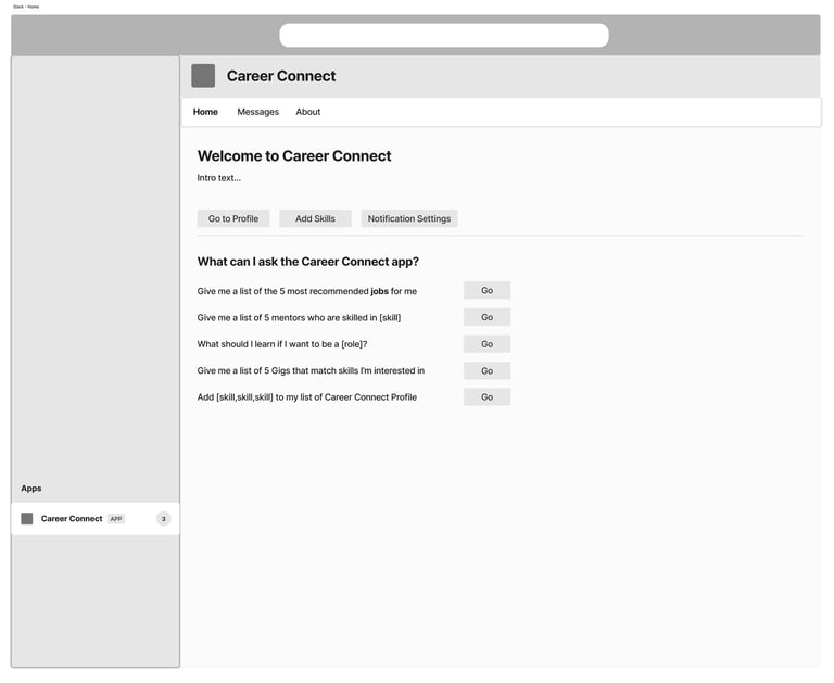
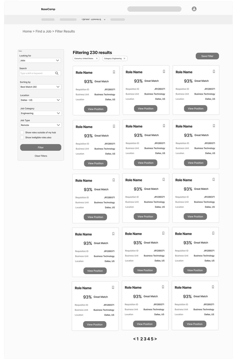
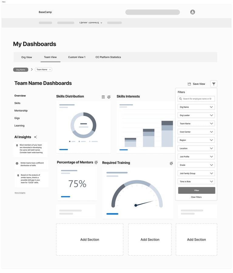
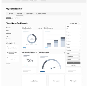
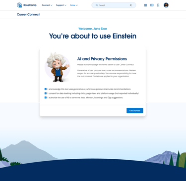
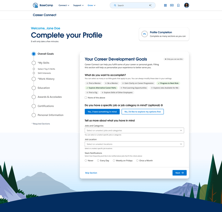
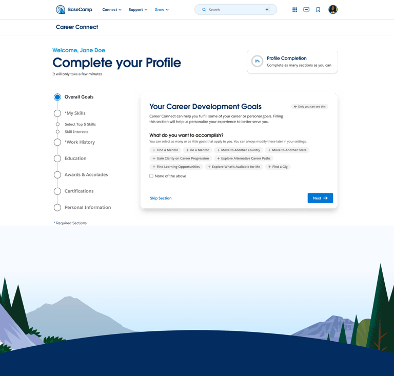
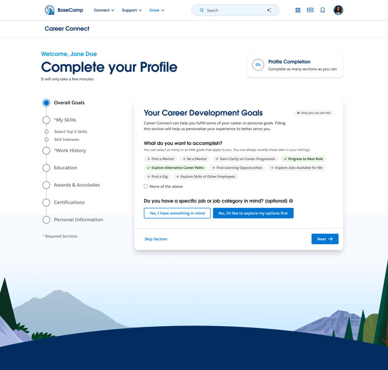
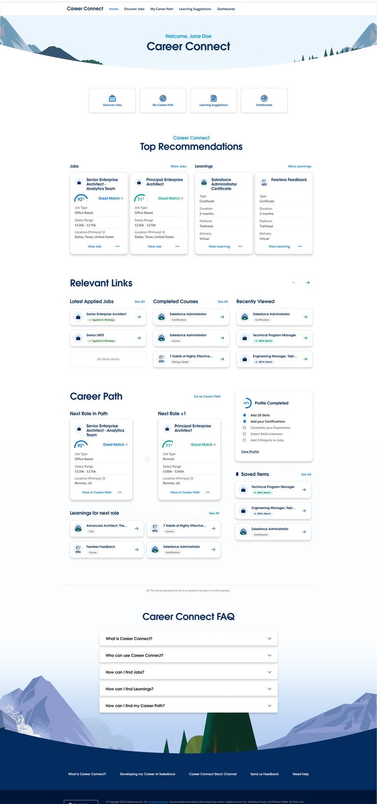
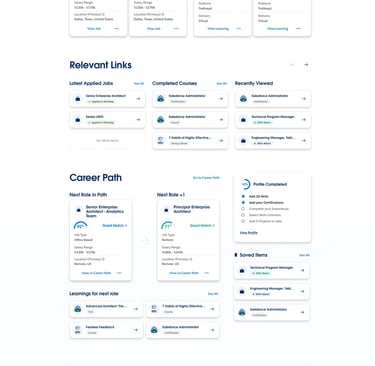
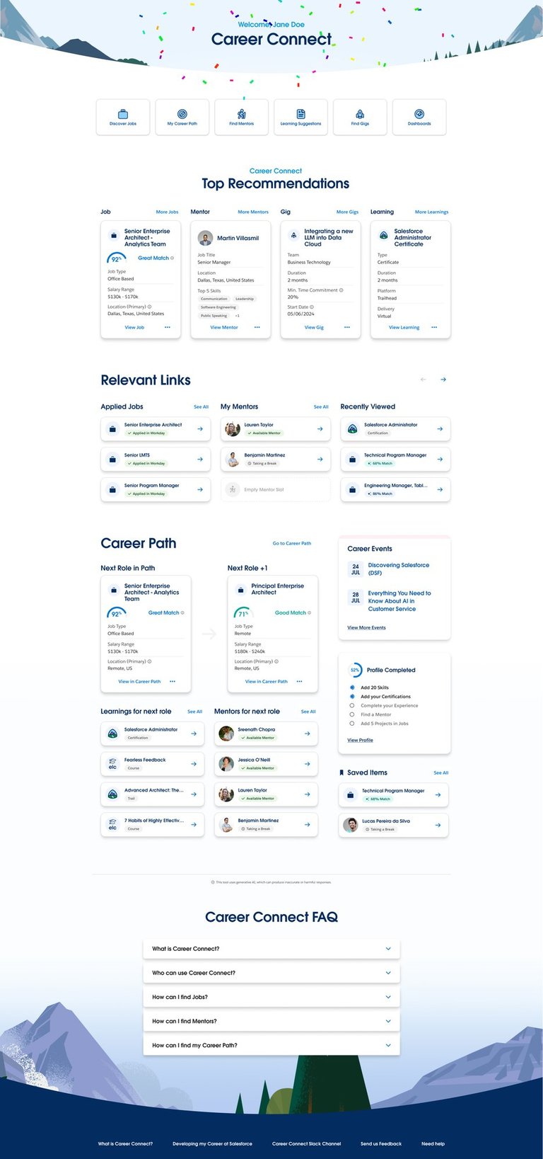
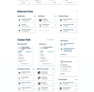
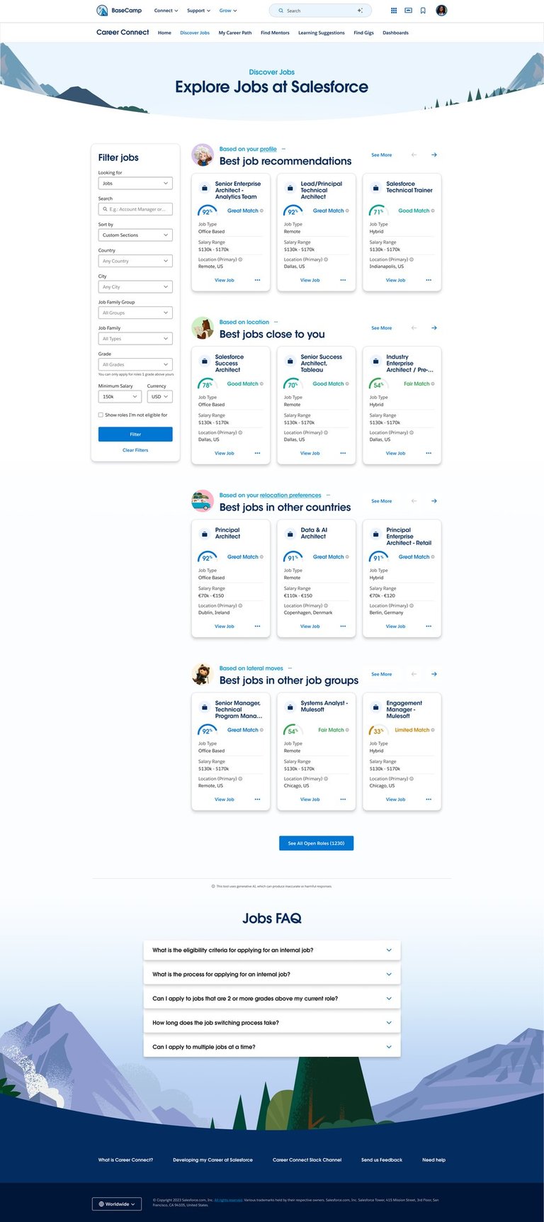
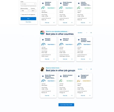
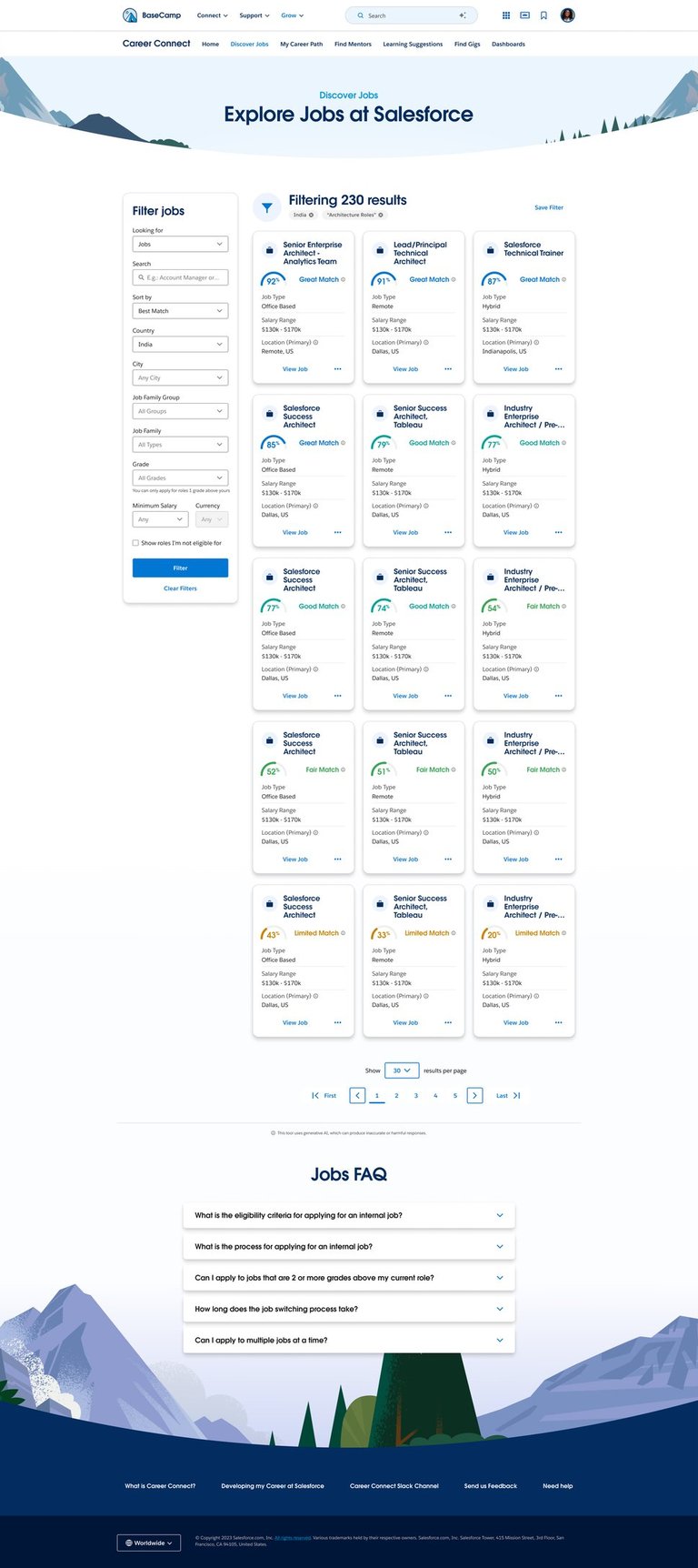
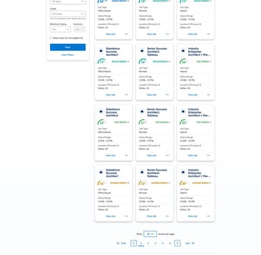
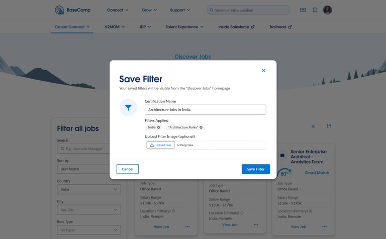
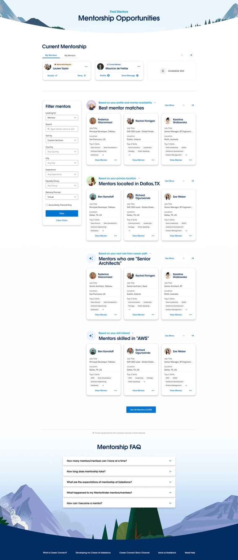
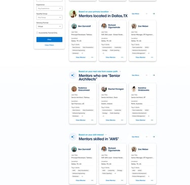
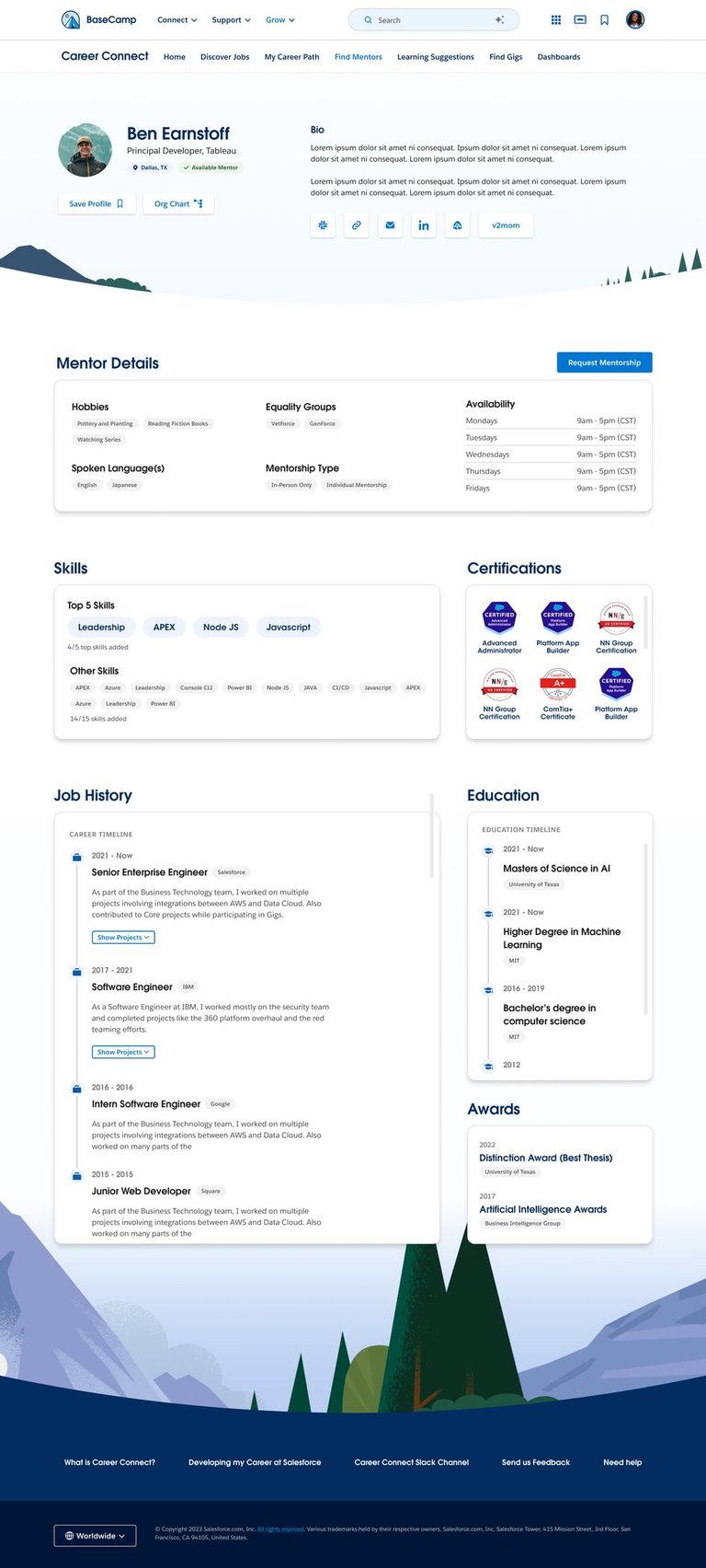
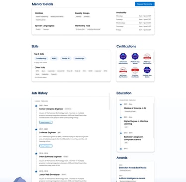
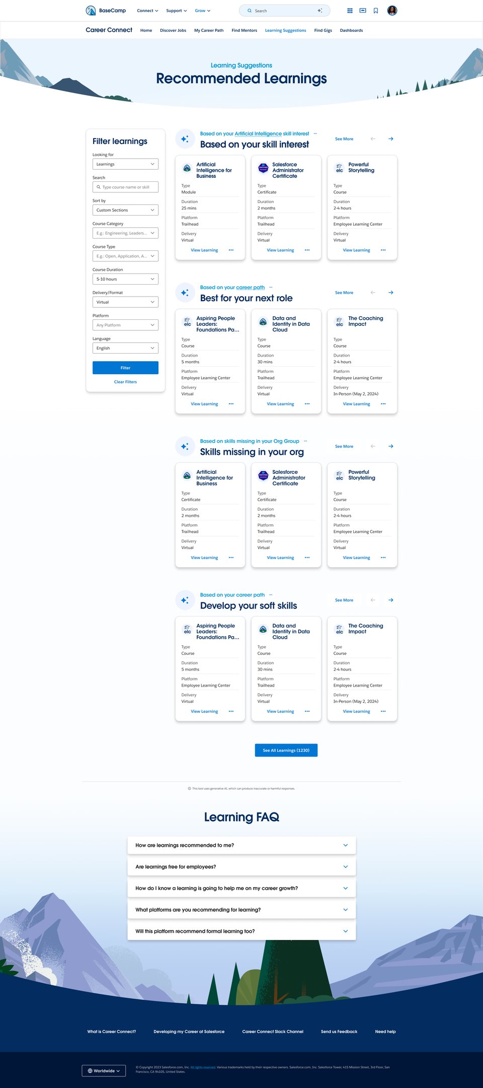
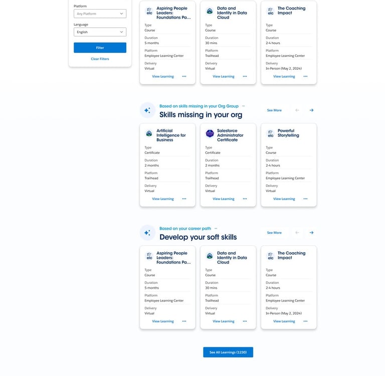
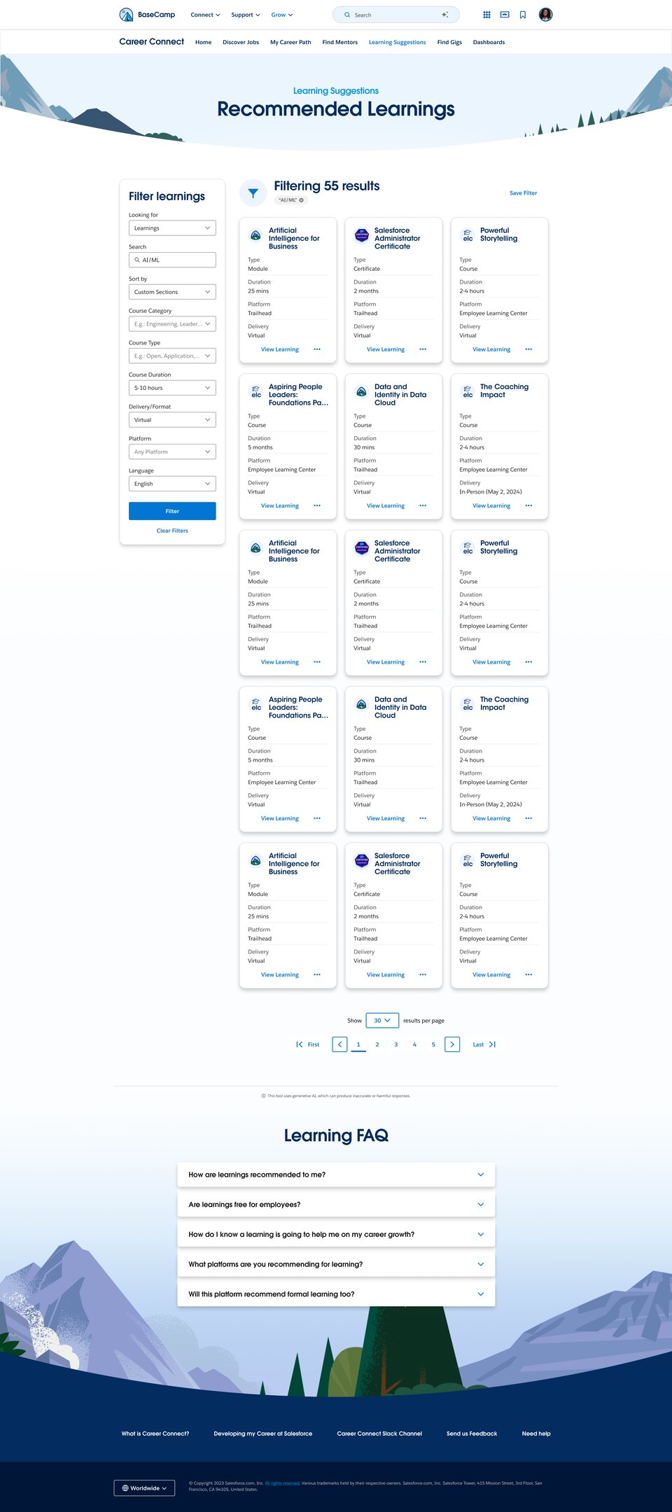
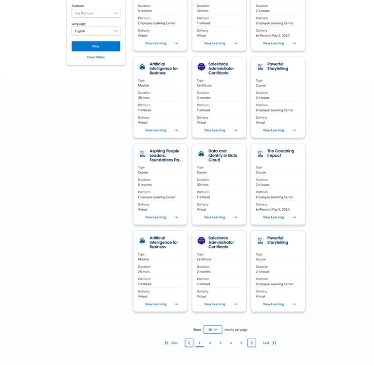
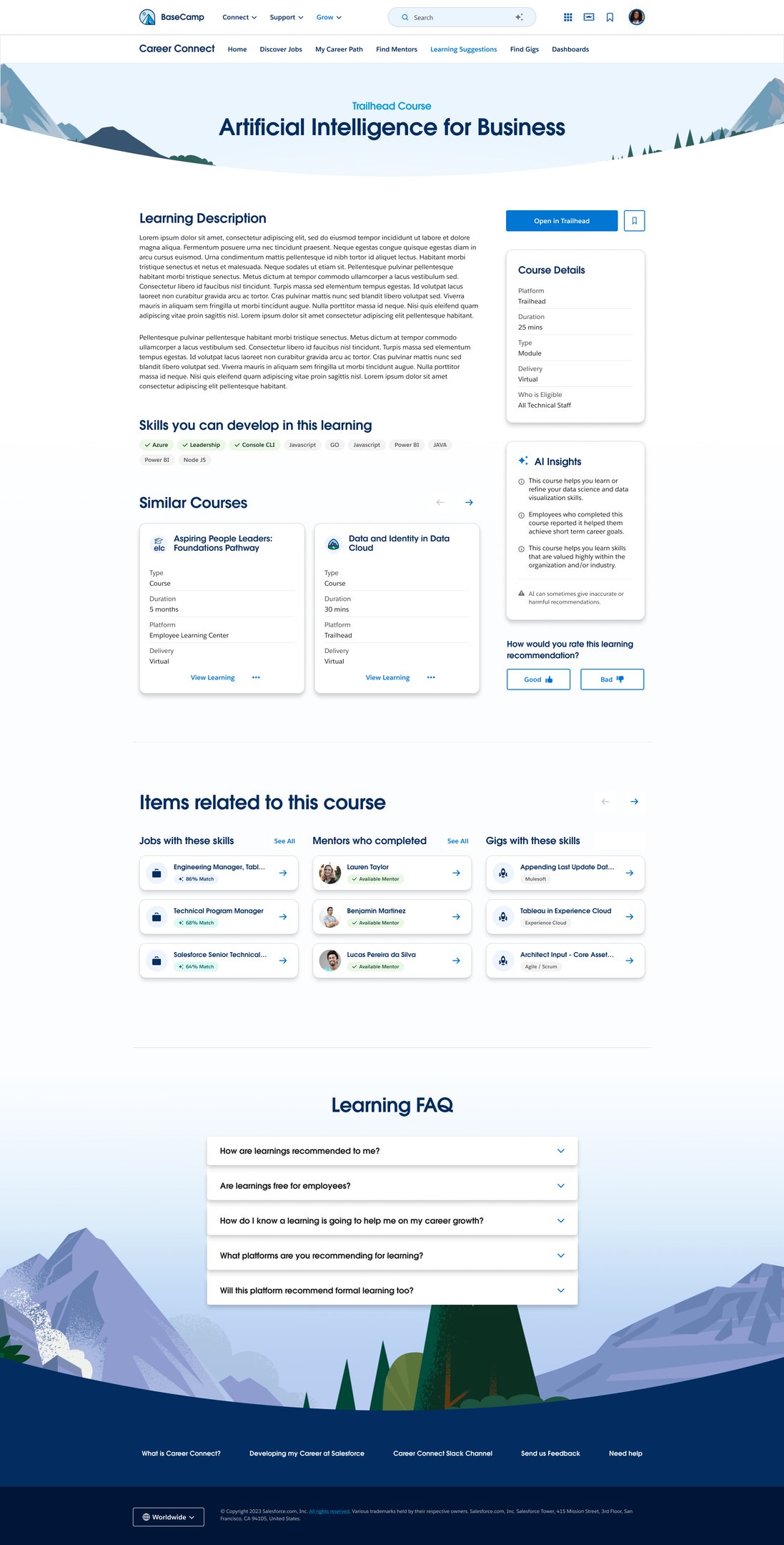
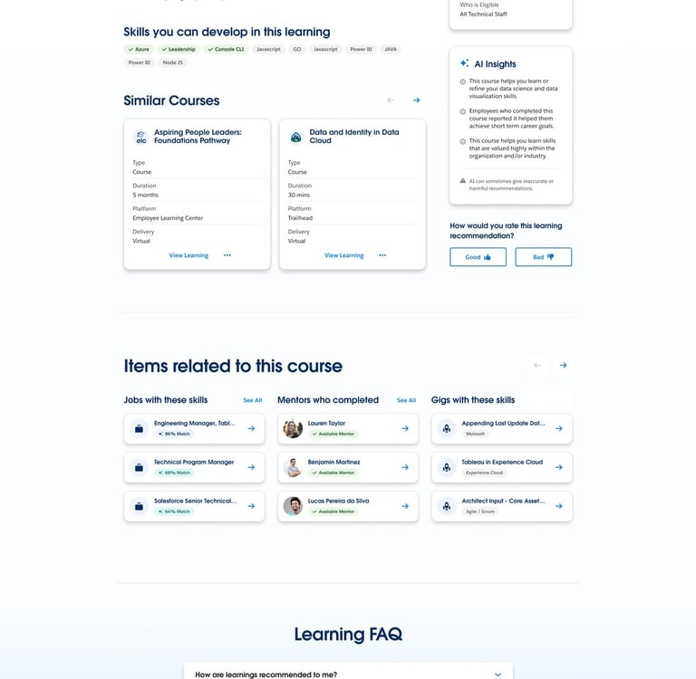
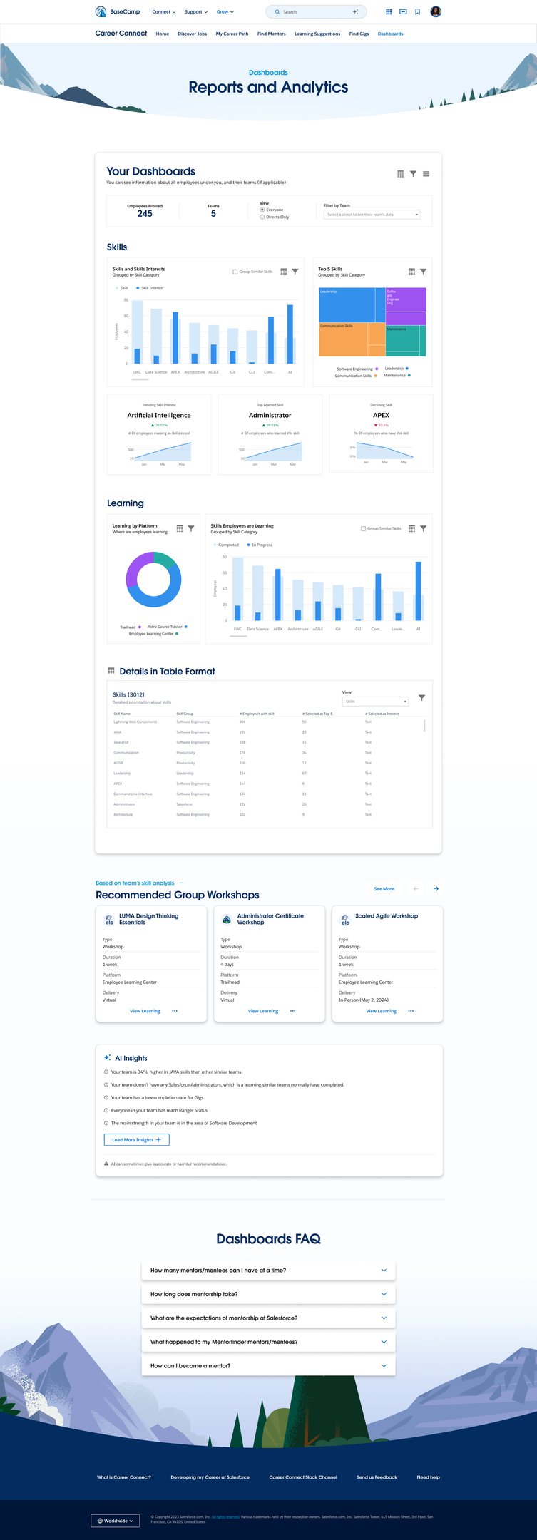
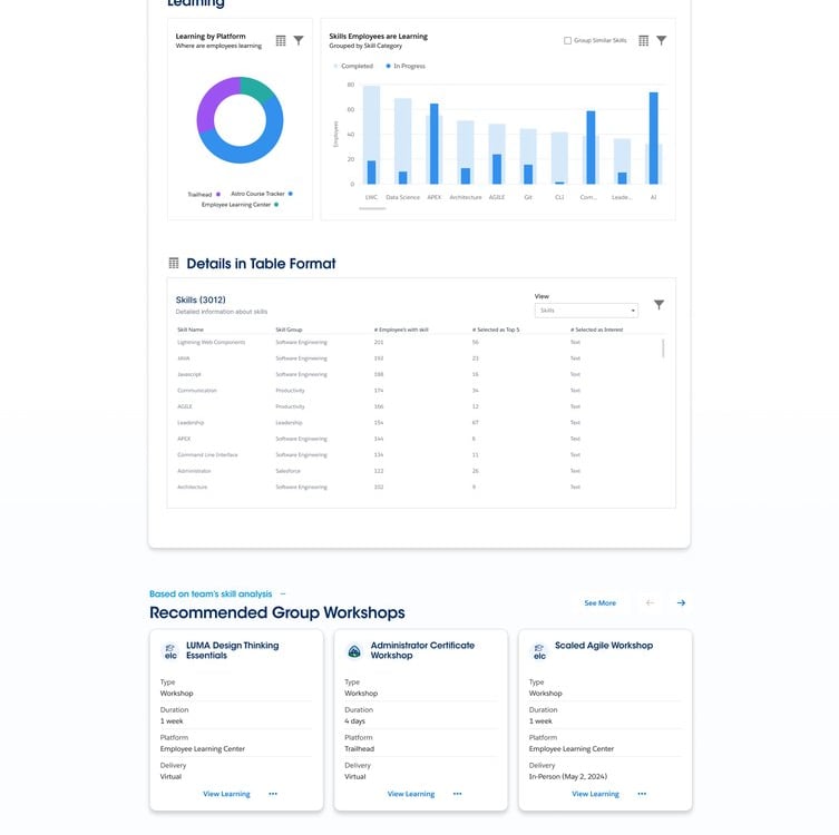
The high-fidelity wireframes in the Career Connect Salesforce project are designed using the Salesforce Lightning Design System (SLDS) to create a scalable, enterprise-grade user experience with strong visual consistency and usability. The designs transform the validated low-fidelity journeys into polished interfaces by integrating reusable Lightning components such as cards, forms, navigation systems, dashboards, tables, and action modules that closely align with Salesforce development standards. SLDS helps maintain a consistent design language, accessibility compliance, responsive layouts, and seamless interaction patterns, ensuring the platform feels intuitive across all user roles and workflows.
The high-fidelity screens focus on creating a connected employee growth ecosystem by visually structuring modules such as Profile Management, Jobs, Gigs, Mentorship, Learning, Talent Planning, and Analytics into a unified experience. Each interface is crafted to improve task clarity, reduce cognitive load, and enable faster navigation through clean layouts, meaningful hierarchy, and action-driven workflows. The role-based dashboards and personalized experiences for employees, managers, HR teams, and leadership help streamline internal mobility, career development, and organizational planning.
By leveraging reusable SLDS components and Figma design libraries, the project achieves faster design iteration, efficient developer handoff, and scalability across future modules and enhancements. The high-fidelity wireframes also bridge the gap between UX strategy and production-ready implementation by aligning design tokens, spacing systems, typography, and interaction behaviors directly with Salesforce standards. This approach ensures the final product is visually cohesive, technically feasible, accessible, and optimised for enterprise-level performance.
Onboarding Screens


Home Screens
Job's Listing & Selection Flow
Mentorship Flow
Gigs
Learnings Flow
Analytics
A/B Testing
Usability Testing
Accessibility Testing
Product Testing Methodologies on Final Mock up
A/B Testing on Home Page Design
A/B testing is a controlled experiment that compares two (or more) variants of a design, copy, or flow to determine which performs better on a defined goal (e.g., higher click-through, faster task completion, fewer errors). Users are randomly split so one group sees version A (control) and another sees version B (variant). You track a primary metric—like click-through rate, conversion, or time to complete a task—and analyze whether differences are statistically significant. It’s best when you change just one element (such as a CTA label or layout) to avoid confounding results. Insights from A/B tests guide data-driven decisions and incremental improvements to usability and business outcomes.
Define the objective and primary metric
Example objectives and matching metrics:
Increase job application starts: primary metric = Apply CTA click-through rate (CTR).
Improve filter usage: primary metric = filter interaction rate; secondary = time-to-first-relevant-result.
Reduce drop-off in a multi-step form: primary metric = step completion rate; secondary = time-on-task, error rate.
Select the testable element(s)
CTA label: “Apply Now” (A) vs “Start Application” (B).
CTA prominence: solid primary button (A) vs sticky footer CTA (B).
Job card layout: condensed info-first (A) vs visual badge + highlights (B).
Filter panel: collapsed with chips (A) vs expanded side panel (B).
Form stepper: long single page (A) vs multi-step wizard with progress (B). Pick one variable per test to avoid confounding.
Create the variants in Figma/FigJam
Duplicate the relevant frames and label clearly:
Candidate – Job List – vA
Candidate – Job List – vB
Ensure parity: both paths must support the same end state (e.g., confirmation screen).
Add an instrumentation plan note on the FigJam board beside each variant.
Instrumentation plan (what to track)
Events:
view_job_list, click_filter, set_filter, view_job_details
click_apply_CTA, start_application, submit_application
error_validation, abandon_step, complete_step_n
Timers:
time_to_first_click (ms), time_job_list_to_apply_start (s)
Funnels:
List view → Details → Apply click → Submit confirmation
Guardrails:
Bounce rate, scroll depth, misclicks. If using a prototype testing tool (Maze, Useberry, UXtweak), map each success screen as a “goal.”
Traffic split and audience
Split: 50/50 random assignment.
Segments worth monitoring:
Device: desktop vs mobile
Experience: first-time vs returning
Role: candidate vs recruiter (if both are in scope, run separate tests)
Sample size and duration
Quick rule of thumb: for a baseline CTR of 10% and wanting to detect a +3 pp uplift (to 13%) at 95% confidence and 80% power, you’ll need roughly 2,000–3,000 exposures per variant. For lab-style prototype tests, use directional signals and follow with a production test if possible.
Minimum run time: at least one full usage cycle (e.g., 1–2 weeks) to smooth weekday/weekend effects.
Success criteria and stopping rules
Predefine:
Minimum Detectable Effect (MDE): e.g., +2–3 percentage points on CTR.
Significance: p < 0.05; Power ≈ 0.8.
No peeking: evaluate only at pre-set checkpoints or via sequential testing methods.
Stop when:
You hit the sample size and the result is significant, or
A variant clearly underperforms (negative trend beyond MDE) and violates guardrails (e.g., higher error rate).
Analysis plan
Compute lift: (B − A) / A.
Check guardrails: time-on-task, error rate, form abandonment.
Segment cut: ensure the winner holds for key segments (device).
Qualitative overlay: combine with brief post-task questions (“What, if anything, felt confusing?”) to explain the why.
Decision and rollout
If B wins: ship to 100%, monitor with the same metrics for two weeks.
If inconclusive: iterate a stronger contrast in the hypothesis (e.g., CTA placement + copy) or test a different lever (e.g., microcopy near requirements).
If A wins: document the learning and queue a new hypothesis.
Ready-to-use artifacts you can paste into FigJam
A) Hypothesis card
Hypothesis: Changing [element] from [current] to [proposed] will increase [metric] because [reason].
Variants: A = [describe], B = [describe]
Primary metric: [e.g., Apply CTA CTR]
Secondary metrics: [time to apply, error rate]
MDE: [e.g., +3 pp]
Risk/guardrails: [e.g., no increase in error_validation]
B) Test checklist
One variable changed
Parity of flows and states
Events and goals defined
Traffic split configured
Sample size estimated
Start/stop dates set
Analysis owner assigned
C) Results board template
Metric table:
Variant A: impressions, clicks, CTR, completion rate, avg time
Variant B: impressions, clicks, CTR, completion rate, avg time
Lift: +/− %
p-value:
Notes:
Top observations
Segment anomalies
Recommended decision
D) Candidate flow example tests
CTA label test
A: “Apply Now”
B: “Start Application”
Metric: click_apply_CTA CTR
Rationale: “Start Application” may signal length but intent clarity; test if action phrasing drives more starts.
Job card density test
A: Compact list with key tags (location, experience)
B: Card with highlights (salary band, benefits icons)
Metric: view_job_details rate; secondary: time_to_first_click
Rationale: Rich info may improve scent but could slow scanning.
Filter visibility test
A: Collapsed filters with prominent chips
B: Persistent left filter panel open by default
Metric: set_filter rate; secondary: success in finding a matching role
Rationale: Exposed controls may increase use but compress content area.
E) Form flow example test (application)
A: Single long form with inline validation
B: 3-step wizard with progress bar and save-later
Primary: submit_application rate
Secondary: error_validation per session, time_on_task
Rationale: Chunking can reduce overwhelm but add navigation overhead.
F) Recruiter flow example test
A: Pipeline board with drag-and-drop lanes
B: Table view with bulk actions and filters
Primary: move_to_next_stage actions per session
Secondary: time_to_move_candidate, error_toast occurrences
G) Copy microtest
A: “You meet most requirements” helper text
B: “Good match: based on your profile” helper text
Primary: click_apply_CTA CTR
Guardrail: No spike in unqualified applications (proxy via rejection-at-screen rate if available)
Practical tooling options
Prototype testing: Maze, UXtweak, Useberry (Figma/FigJam friendly)
In-product testing: Google Optimize alternatives, Optimizely, VWO, LaunchDarkly (for feature flags)
Analytics: GA4, Heap, Mixpanel; for prototypes, rely on the platform’s built-in metrics
Next step If you can paste a snapshot or describe what’s on the A/B Testing FigJam board (e.g., which screens or CTAs are under consideration), I’ll tailor the exact hypotheses, variant specs, event names, and a sample size estimate to that content.
Usability testing
Usability testing was conducted to evaluate how effectively users could navigate and interact with the platform while completing key tasks. The study uncovered valuable insights into user behavior, navigation patterns, content clarity, and overall task success rates. Several usability challenges were identified, including navigation confusion, form interaction issues, and the need for clearer system feedback. Based on participant observations and feedback, prioritized recommendations were developed to improve efficiency, reduce friction, and enhance the overall user experience. The findings provide a strong foundation for data-driven design decisions that will increase user satisfaction, engagement, and product usability.
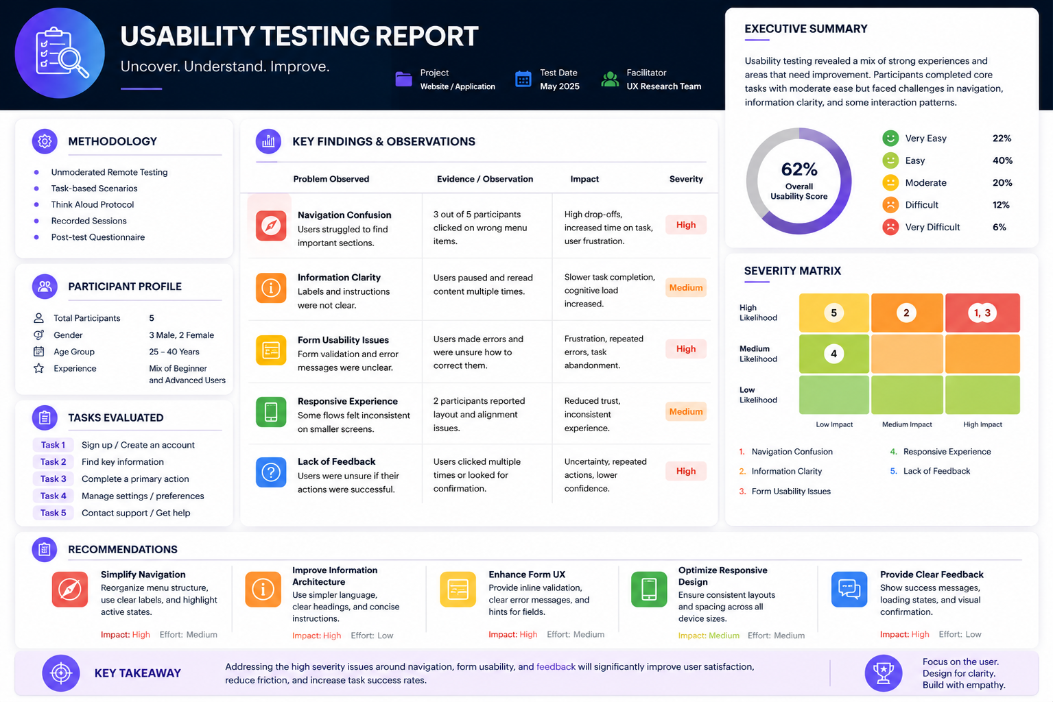
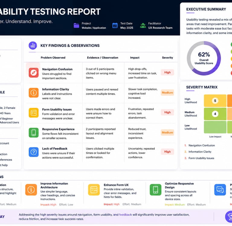
The study uncovered valuable insights into user behavior, navigation patterns, content clarity, and overall task success rates. Several usability challenges were identified, including navigation confusion, form interaction issues, and the need for clearer system feedback. Based on participant observations and feedback, prioritized recommendations were developed to improve efficiency, reduce friction, and enhance the overall user experience.